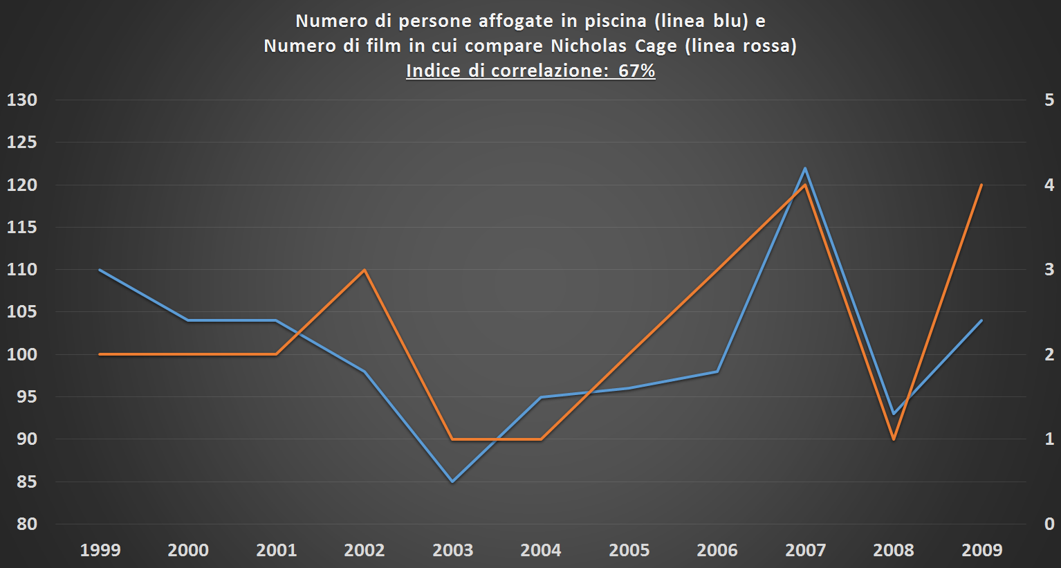
Have you ever heard a phrase like this? “A new Nicholas Cage movie just came out, so the number of people who drown in swimming pools is about to rise.” Probably not, and if you did hear it from a friend… well, you might have asked yourself a few questions about their mental state. However, looking at the graph below – based on real data – your friend might actually be right.
What does this graph tell us? Let’s start with that number highlighted in the title, known as the correlation index. The linear correlation index is a measure that describes how much one variable changes when another changes. An index of 100% means that as one variable increases, the other increases in exact proportion. The index for the two variables shown in the graph (the number of people who drown in swimming pools and the number of movies featuring Nicholas Cage) is 67%, a rather high value. This means that the two variables have moved almost in sync over time, and we can say that there is a strong correlation between them.
So, where’s the mistake? The mistake in the initial statement lies in assuming a cause-and-effect relationship (causality) between the two variables. The old adage that every statistics student has likely read at least once in their life states: “Correlation does not imply causality.” Or, in other words, correlation is a necessary but not sufficient condition for causality.
It seems like a trivial statement, but in reality, it’s not as obvious as we might think. In the example above, it’s clear that only a madman would imagine a cause-and-effect connection between the two variables, but when applied to more realistic cases, we can say that all correlation measures in any statistical study never assume a causal hypothesis. Every correlation index provides a mere numerical result, and it’s up to us to establish a cause-and-effect relationship based on the logic of the facts or certain assumptions.
As incredible as it may sound, there are many variables that are almost inextricably correlated (correlation coefficients above 90%) but have no logical connection. Here are some real examples from the United States in recent years:
- Per capita mozzarella consumption and PhDs in civil engineering (correlation 95%)
- Per capita margarine consumption and divorce rate in Maine (correlation 99%)
- Barrels of crude oil imported to the USA from Norway and drivers dying in car crashes with trains (correlation 95%)
In all these cases, the two variables are so completely disconnected that the high correlation is undoubtedly due to the irony of chance, and we can confidently rule out any cause-and-effect relationship.
But what about other cases? In other cases, we face situations where seemingly inexplicable correlations are actually phenomena of indirect correlations, often difficult to interpret. Consider the following pairs of variables:
- Ice cream consumption and shark attacks
- Air traffic density and spending on cultural activities
- Number of bars in a city and the number of children enrolled in school
Obviously, these are not direct correlations, since in all these cases, the first variable (A) and the second variable (B) are not directly related to each other. But upon closer inspection, we realize that the two variables are not entirely unrelated, but are both linked to a third, latent or unmeasured variable (variable C), which causes a phenomenon called “spurious correlation.” Any ideas? Think of these variables:
- Average temperature (both phenomena are more frequent in summer)
- Per capita income (both phenomena are more likely in cities with a higher average income)
- Population size (both phenomena are related to the number of people in the city)
With these “hidden” variables, we can solve the mystery of the inexplicable correlations: even though A and B aren’t directly connected, variable A is linked to C (the latent variable), and variable C is linked to B.
Obviously, depending on the complexity of the study, it can be very difficult to understand whether a high correlation index is due to a cause-and-effect phenomenon, a spurious correlation, or neither. The key point is the need to carefully interpret every correlation index to avoid drawing totally wrong conclusions.
So, what’s the takeaway from these examples? I’d say it’s a kind of demystification of “numbercracy,” the idea that numbers have the power to explain reality uncritically. Numbers and statistical indices are useful, indeed incredibly useful, for understanding real-world phenomena, but they always require interpretation and critical judgment before being accepted as dogma and conveying a potentially incorrect meaning.
But just to be safe, the next time a Nicholas Cage movie comes out… stay away from the pools! 🙂

